
Full Health Brand Identity
I had the opportunity to partner with University of Pittsburgh Medical Center (UPMC) on the launch of a revolutionary doctor-prescribed and insurance-funded healthy meal kit system. They needed someone to fully brand and execute this new system, from brand platform, to brand name, to identity mark, and a full visual toolkit.
The name Full Health was born from the core idea that both current diet programs and current medicinal solutions are incomplete—that medicine treats the symptoms of illness, while food treats illness from its source, and that to sustain lifelong health you must teach someone the right way to choose, prepare, and enjoy food. For the logo design, it was important to strike a balance between something that looked trustworthy and reputable enough to be doctor-prescribed, but approachable enough to appeal to the everyday consumer who sees multiple meal kit options on the market. The typography and logo connote the ideas of humanity, science, and fullness.
Starting with why
The team at UPMC were attempting to do something revolutionary, to consider food as medicine to the point that they could prescribe it and get insurance to cover it. But they hadn’t yet gotten down on paper how and why this mattered to both patients and their doctors. I performed a competitive audit and interviewed several doctors and real people to understand and articulate their brand platform that fed into the visualization of the brand identity.

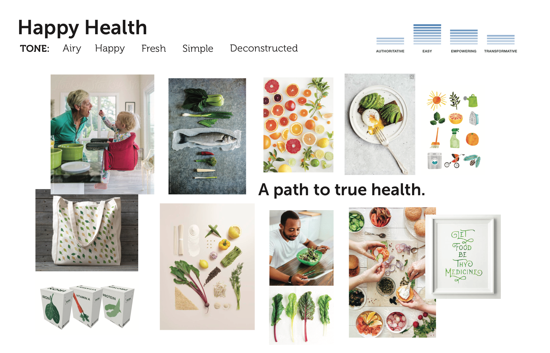
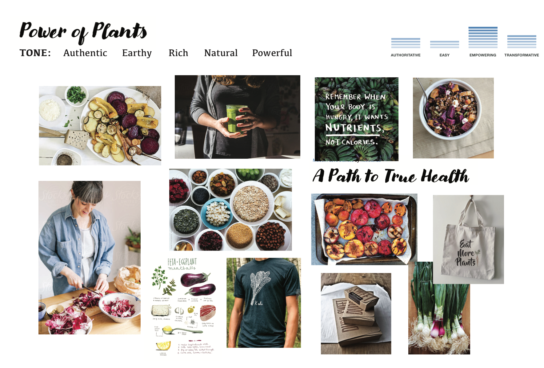
Visualizing the Values
Once the brand values were solid, I amplified them at various levels to show possible visual and tonal articulations of the brand.
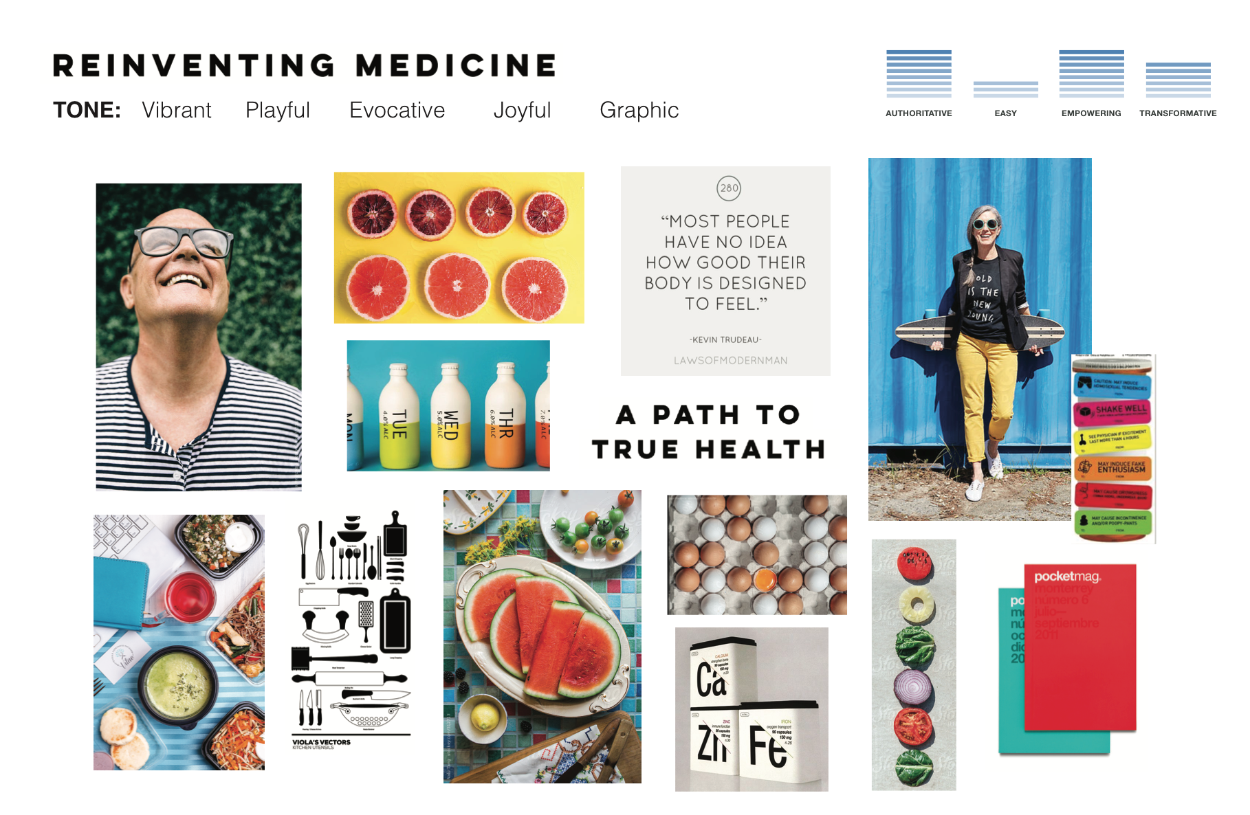
Distilling the brand
We landed on the direction of reinventing medicine—vibrant, playful, evocative, joyful, and graphic—from which I created a color palette, typography system, photography point of view, and a series of design provocations to that became the foundation for Full Health’s initial market launch.


